Buttons can play an important role in shaping the navigation and user experience on your website. They can serve as connectors, allowing you to connect pages together and can help provide a roadmap for your users to get from one piece of content to another. However, understanding how to use buttons effectively is key to ensuring a positive interaction for your users. Today, we'll explore three strategies to make the most of your buttons.
Tip 1: Avoid button overload
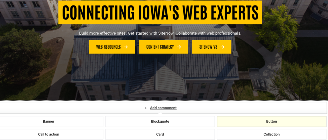
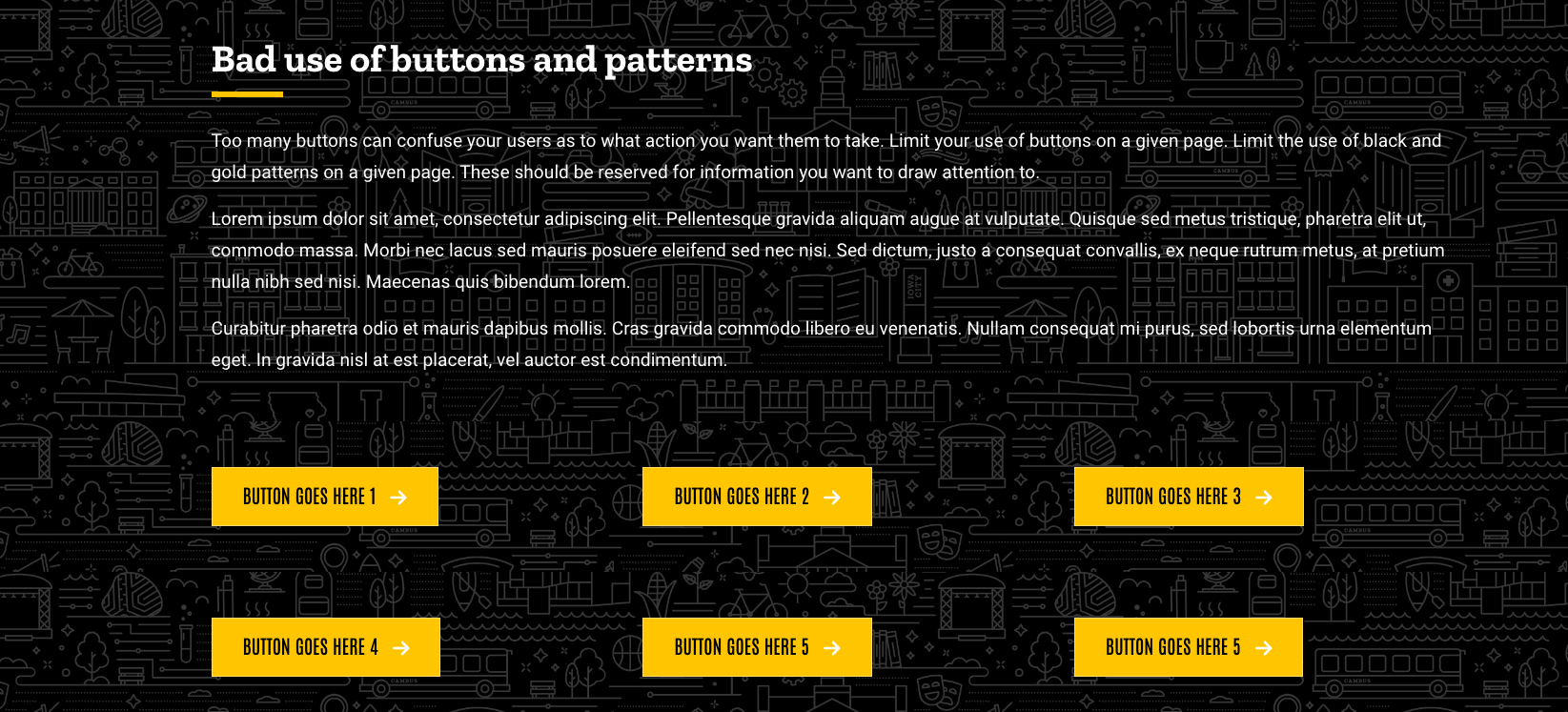
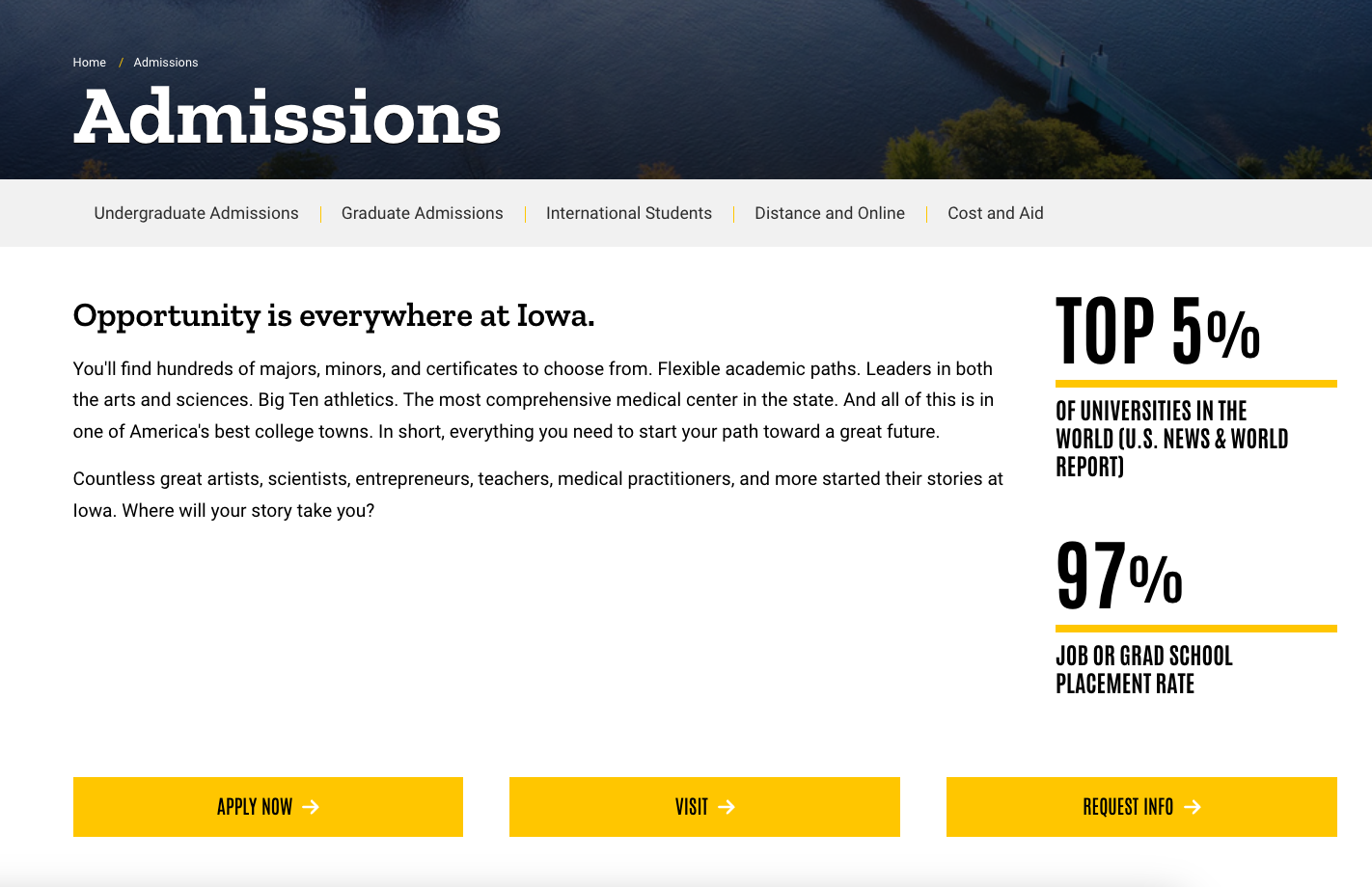
One of the first things to keep in mind is to avoid the use of too many buttons on a given page and throughout your site. While the instinct may be to add more buttons, doing so poses the risk of confusing and overwhelming users. When introducing buttons, prioritize the content that can be used in a button format. If you have a lot of content on your site, find alternative components to meet your needs instead of an overreliance on buttons. Using too many buttons can leave users overwhelmed and unsure where to turn next. By limiting your button use, you can effectively guide your users to where you want them to look for more information.
Tip 2: Leave space and provide ample padding
When incorporating button components, it's essential to allow for ample white space and padding. Failing to do so can result in buttons appearing cluttered and unprofessional. Proper spacing not only enhances the visual appeal but also provides a respite for the eyes from a jumble of button content.
Make sure your buttons align correctly within the container width, maintaining even spacing, especially in multi-button layouts. For example, if you have two buttons, make sure they are evenly spaced in a two column layout. Avoid placing buttons on overly busy, patterned backgrounds, as this can hinder readability and create a visually chaotic experience.
Tip 3: Write effective button text
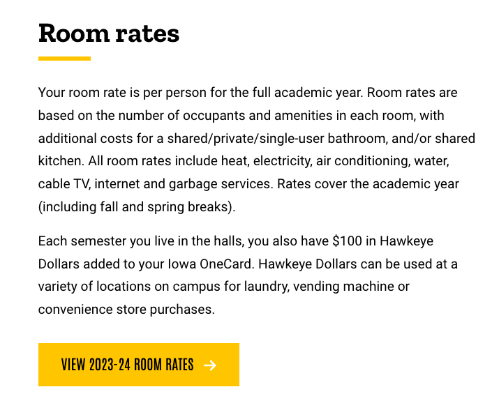
We’ve all seen the ‘learn more’ or ‘click here’ text on buttons on numerous websites. While using this text isn't inherently bad, consider using more descriptive button text. Think of your button as another call-to-action instructing the user where you want them to go or what action you want them to take. Use text that is actionable and tells the user what you want them to do. This will help your users to understand what is next and what they can expect to find when clicking on the button.
Buttons may seem straightforward, but their role is more than just another component. Buttons serve as another guide for users as they navigate your site. Getting them right is not only about aesthetics, but also about creating a seamless experience, guiding users to the content they need and creating an enjoyable experience for all users.