You’ve received your SiteNow v3 site, determined your main menu structure, identified your target audience, and know your redesign goals for your website. What’s next? It’s time to create pages and infuse them with captivating content. As you work to add content to your site, it's essential to ensure that your pages are not only well-organized but also visually appealing to your users. Today, we’ll talk about 4 valuable tips for crafting and arranging your pages using Layout Builder, all while delving into the best practices for effective page design.
Tip 1: Organize related content together
Imagine each page as an information hierarchy, a structured presentation of the most important content you want your users to engage with. When laying out your page, it's crucial to group related content together. For instance, if you aim to showcase program details, application instructions, and class information all on a single page, ensure these are organized as a coherent unit. This approach establishes a visual hierarchy that enhances the user's reading experience.
Tip 2: Be mindful of colors and patterns
For the majority of your page, gray and white are your allies. These colors are not only visually pleasing but also highly accessible, preventing users from feeling overwhelmed by content. Gray serves the purpose of visually separating content while maintaining a neutral page design. Both gray and white effectively break up different sections on a page.
When considering background colors and patterns, remember that less is often more. While these elements can be excellent for creating visual distinctions, it's vital to exercise restraint. Overusing a variety of colors, such as gold or black, can confuse and overwhelm users, making the page appear cluttered. Gold, being a warm color, may appear closer to the viewer than cooler colors on the spectrum. Excessive use of black in the background can pose reading challenges for some users. It's advisable to reserve these colors for highlighting critical information or actions you want users to take. The same principle applies to background patterns.
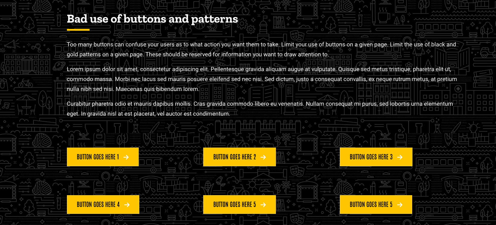
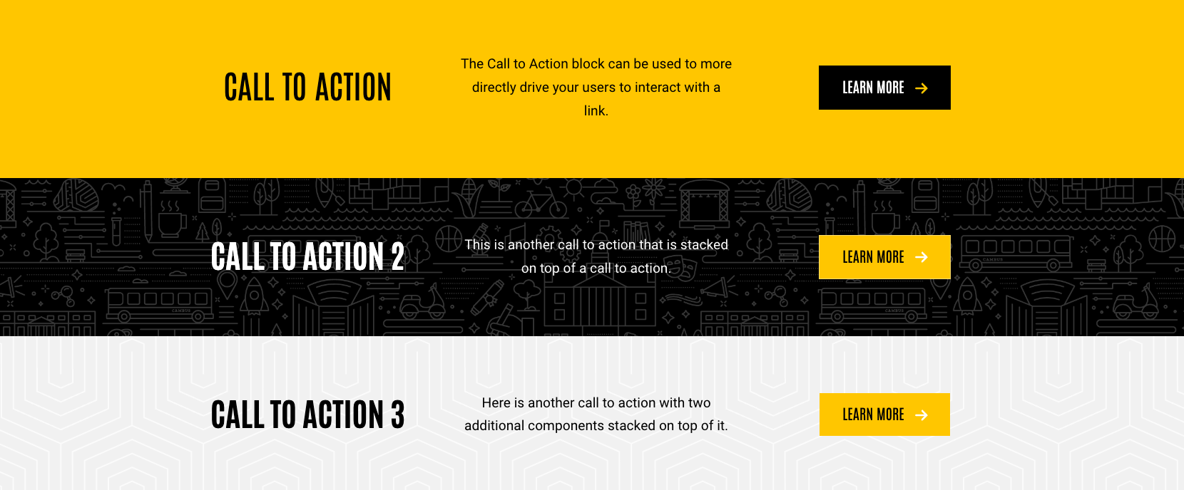
Tip 3: Limit use of Layout Builder components on a given page
Components add vitality, style, and design to your pages, but it's crucial not to go overboard with them on a single page. When too many components of the same type are densely packed together, it can overwhelm users.
For instance, an excess of "calls to action" content types on a page can pose challenges for users. These should be employed selectively, and reserved for specific messaging or content where you want to capture attention. The presence of an excessive number of calls to action can befuddle users, leaving them uncertain about the primary actions you intend for them to take on the page. Some pages, in fact, may require none at all and should serve as straightforward sources of information for your users.
Similarly, consider the use of button content types, which should be reserved for specific user action steps. Overloading a page with an abundance of buttons can inundate users, making it unclear which actions hold priority.
Tip 4: Maintain consistent alignment
When it comes to online reading in English, our eyes naturally flow from left to right. This familiar reading pattern holds true for website pages as well. Keeping this alignment in mind is essential when crafting your pages. When you add content to your site, it's crucial to ensure that the alignment remains consistent within each content block. For example, if you opt for left-aligned content, ensure that everything beneath it, like buttons, maintains that left alignment. Likewise, for centered content, aim to keep titles, body text, and buttons consistently centered. This practice isn't just about aesthetics; it's a way to create a visual harmony that helps users immediately recognize that all the elements within a content block are closely related.
Final takeaways
By using these four tips for page layout, you have the power to elevate your pages, making them great for your users. This not only enhances their understanding of your content but also ensures effortless and accessible navigation throughout your site. Consistency in design elements, thoughtful use of whitespace, and attention to component use and alignment, play pivotal roles in creating a visually appealing and organized website. By providing a user experience that is both engaging and user-friendly, you're well on your way to leaving a lasting impression and establishing a strong online presence.