One of the great aspects about Layout Builder (amongst other things) is the ability to add a variety of components in a drag-and-drop interface to a page on your website. These components empower you to build out dynamic pages and can be used as another tool to showcase your department or unit more effectively. One of the most flexible components covered by SiteNow and Layout Builder are dynamic cards. The card component can be used as both an informative piece of content or one that links users off to more content. Cards allow you to seamlessly integrate images, text, and buttons, creating a compelling link to your desired destination. Today, we will look into best practices for utilizing the card component.
Add images or icons to your cards
While not mandatory, adding images or icons to your cards can breath life into this component. With a variety of icons provided by the brand site and a wealth of images available on Mediagraph, your cards can be transformed into dynamic elements that can showcase your department or unit and enhance the visual appeal on your website.
Ensure proper alignment
When using cards, precision is important. As you work to add your cards make sure they have proper alignment and space on your pages. Failing to pay attention to this aspect can result in unnecessary spacing gaps and pages that appear visually disjointed to users. For example, avoid placing three cards in a four-column layout where an evenly balanced three-column layout will do. Ensuring proper page alignment when you add cards will enhance your page's overall visual appearance, cohesiveness, and user experience.
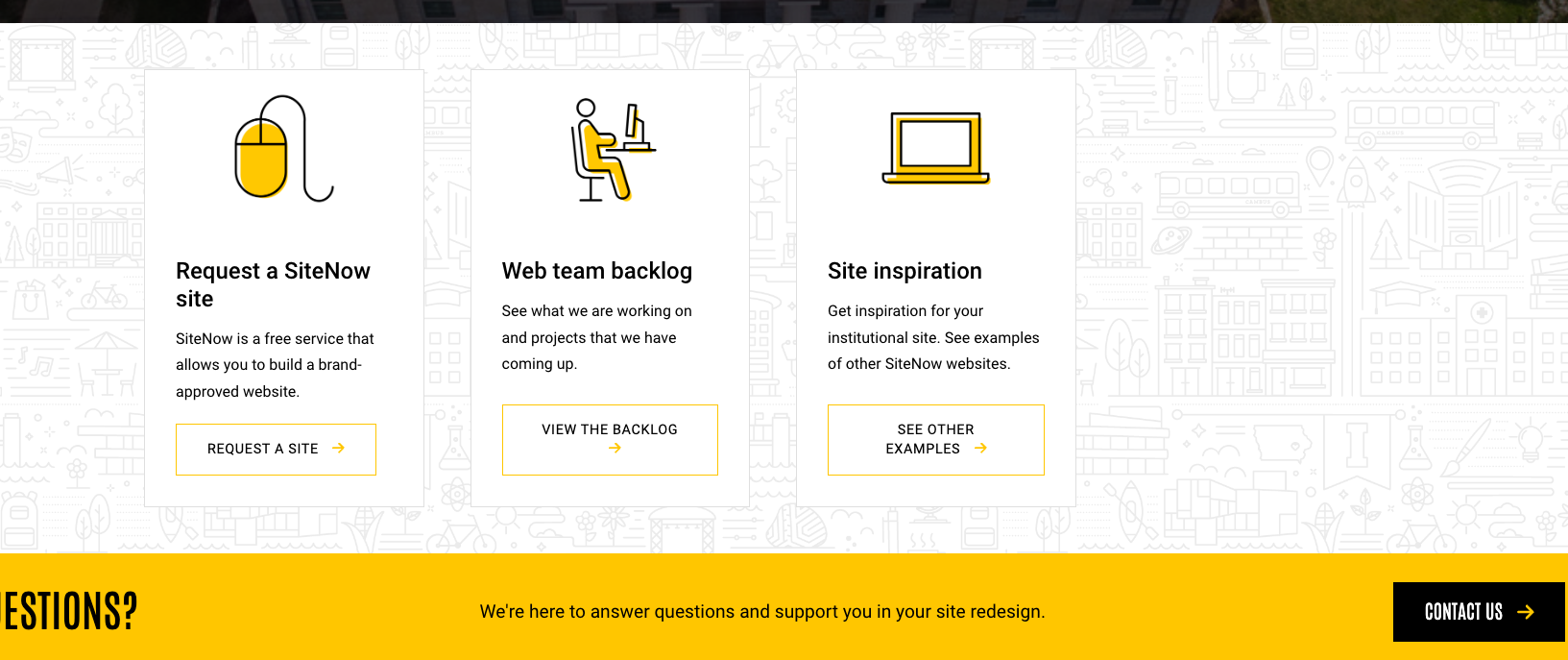
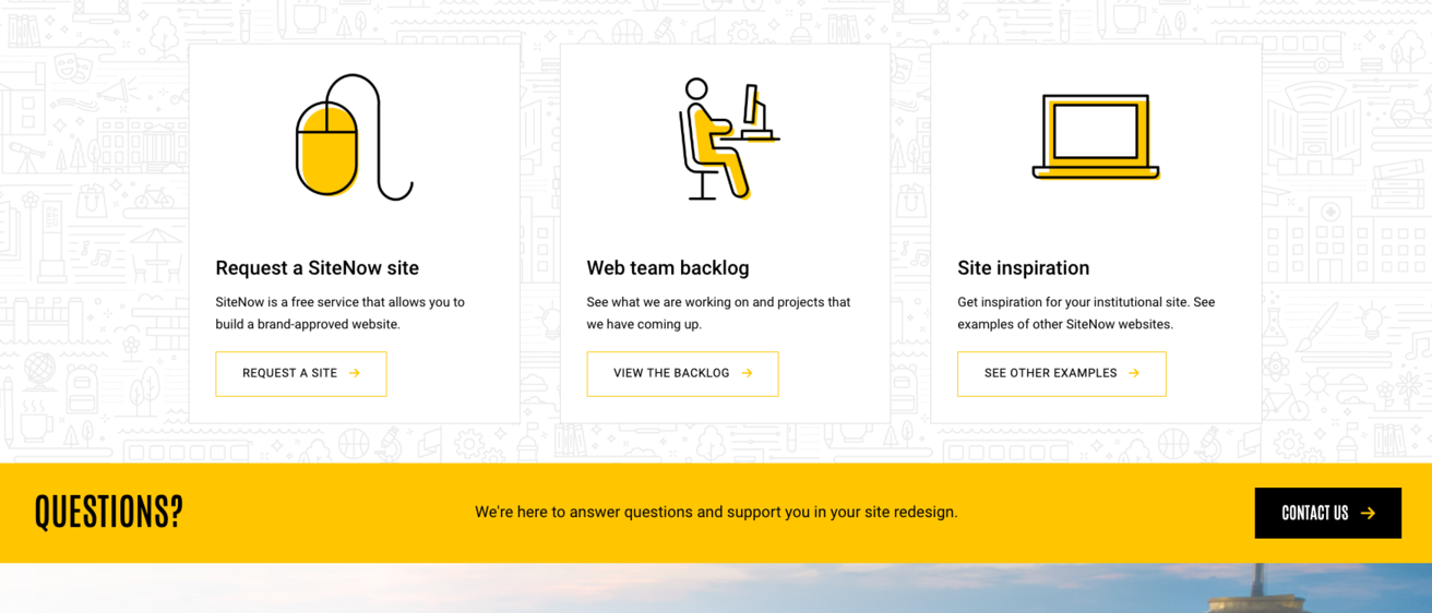
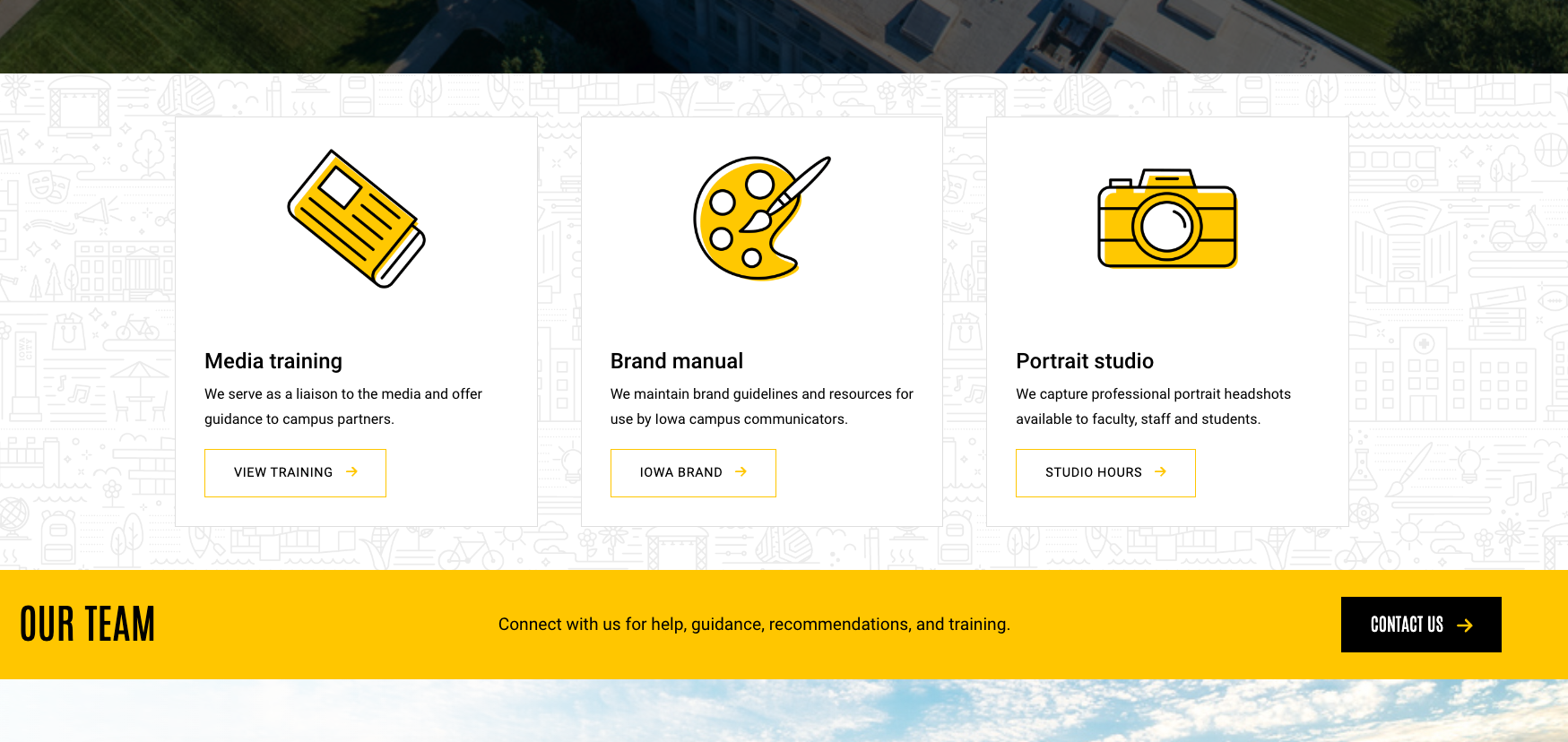
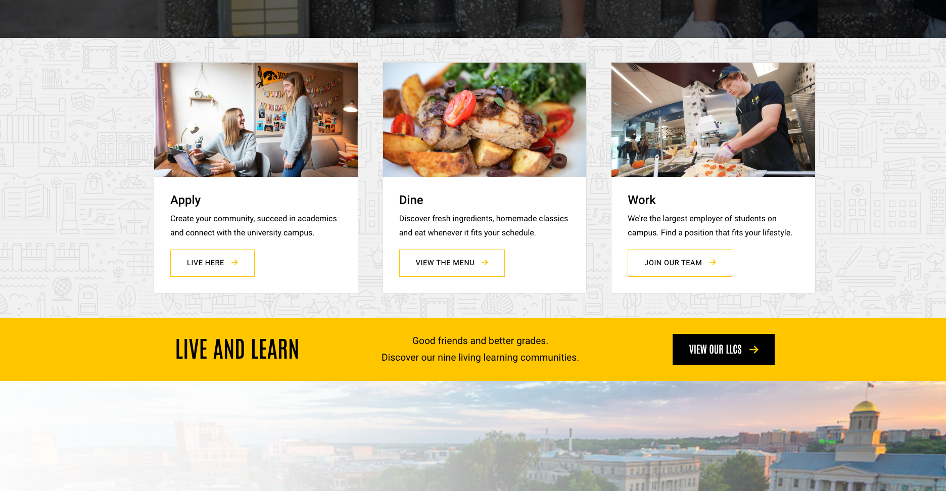
Maintain a consistent style
When working with the card component, it is important to maintain consistency in your style and formatting for cards that are near one another on given page. For instance, in a three-column layout of cards, make sure that all media items within the cards are aligned uniformly and follow the same display format. Divergent formats may result in a visually disjointed appearance for your cards.
Add descriptive text to your cards
Elevate your cards by weaving in descriptive text, which will act as a guide for users. Ideally, this should be short sentences providing more information and help your user understand what they can expect to find then they click on the card. Be careful, as adding too much text can overwhelm the card component itself and the user. Strike the right balance between visual imagery, descriptive text, and button text.
Avoid misuse of cards
While there are many ways that you can use cards, there are also ways that they can be misused. One common mistake to avoid is using them to manage and link to articles on your site. This not only proves ineffective but also poses a challenge for content owners. Opting for this approach complicates content management, necessitating the creation of new cards for each article. Instead, we recommend not using the card component and instead relying on the article component itself. Doing so allows you to easily pull in articles to a given page, provides your users an easy way to read additional articles, and creates an easily accessible article archive for users.
Implementing these strategies can help you make the most of all the card component has to offer. By applying these insights, you can elevate your webpages to showcase your department or unit in a meaningful way and make your site more visually appealing to your users.